Wednesday, December 20, 2017

Atmospheric perspective and self-portrait


          So this is my charcoal atmospheric perspective. I based it on a picture I took up in the north shore. I'm pleased with ho with how the rocks came out, but I could have done the trees much better. I made it so that it was darker in front and lighter in the back, giving it the illusion of the rocks moving away, making it an atmospheric perspective. I could have drawn the perspective part of it out a bit more than I did. I enjoyed using charcoal for the first time and on such a large scale! Now that I have this done, I'm starting on my self-portrait.


      I made this little baby self-portrait so I could get a feel for my face. This was my second try at it, because I wasn't satisfied with my first one. I couldn't get the image of my own face out of my head, and I think that is what messed me up the first time. I started fresh on a new piece of paper and just looked at shapes and where they were in relation to everything else. The shading is a lot of fun, and I have moved on to the hair now. I need to make it darker than I have it right now, but otherwise, I'm pretty proud of how far I've come.
     

Thursday, November 30, 2017

White Still Life


          This is the still life of white object that I had made.  We were practicing our black and white  values with shading white objects. I honestly was trying to avoid the pallet by shading EVERY OTHER THING I POSSIBLY COULD. Thus, while going through with this plan, I had made everything look better than the pallet, which I think is funny and ironic. I think there could be more unity (or harmony) throughout the drawing. Especially with the drapery and the objects. I hadn't seen how the values and shading of the objects compared to the drapes, but now that I look at it from afar and with eyes that has not been looking at it for a long time, I can tell what I could improve. There could be better shading on the opposite side where the light of the lamp does not touch. BUT! I am still very proud of this drawing regardless.

Friday, October 27, 2017

Three Point Perspective


        We are now working on out three point perspective. We are shading using little lines going in different directions, like the drawings in the book series A Series Of Unfortunate Events by Lemony Snicket. We were taught how to use horizontal, vertical, and orthogonal lines to create the effect of looking up at a building. A oddity is required in the drawing and I have decided to make the word "HEY" because the building sort of looks like a H when you look at it the right way. I am not entirely sure how I'm going to do the Y in HEY, but I'll figure it out. I'll know if it looks weird. I really enjoy doing these perspective drawings. I've never done them before but they are really fun. I find, specifically, the shading to be fun. I don't use this technique much, but I have been incorporating it into different drawings lately.

Friday, October 6, 2017

Still Life

        So, here is one of my first big drawings in Drawing class. I'll admit, I started over two times. I guess I'm not all that used to drawing big yet. I'll try to be! So, to measure proportions, we were supposed to use that method that you always see people in movies using. Like, where they stick out their arm and shut one eye and use their pencil or something like that. Yeah. . . . I didn't do that. It kept messing me up! I did that on the first two. when I got to the third one, I didn't even bother. And that one turned out the best, Weird!

          This is a contour drawing, so one continuous line. We were also allowed to put some textures of there too. I'm proud of how my bucket turned out. The texture looks a lot like that. And I might have acidentallyonpurpose put some shading in. I COULDN'T HELP MYSELF IT WAS TOO TEMPTING. SO MANY DIFFERENT SHADES!!

Tuesday, September 12, 2017

Drawing Class

                   Yay! New year, new posts, new class! I am now in drawing. I am first posting these blind and modified contours.


           Okay, so, with the first one we put a paper over our pencil so we could not see what we were drawing. It was quite difficult for me, and it was supposed to be. The second we were allowed to look. I did the same hand gesture I made for the first drawing. We were all supposed to draw with one continuous line, and I enjoyed doing it that way very much.

           The next few drawings we did was of still life. We drew a cone, apple, and brass object (and mine was a mug). Again, we drew with one continuous line. I like how my apple turned out. I feel like I could have done better with my mug though. Well, I like how all of them turned out and I feel like could do better with all of them. Practice, practice, practice.


           Alrighty, besides these drawings, we have been doing gesture drawings. With models and stuff, which is something I've been wanting to do for a LONG time. I never really knew where to start when it came to that stuff, but I certainly do now. I have been given another empty sketchbook. That leaves me with a total of five now. Hope to fill them all up soon!

Thursday, May 18, 2017

Crop Art

         We started crop art a few weeks ago, and I was like, "Yeah, let's get this done!" totally unaware that this would be a laborious process. So, as a person who makes incredibly detailed stuff and then regrets it later, I created a design that was incredibly detailed and I am regretting it. Yet, I feel like it is turning out well. Thankfully. I am using black beans, millet, peas, to name off a few.


         I am using a few seeds that MN State fair deems illegal so I will not be entering it. I just really wanted the hair to have a white outline. I feel like the white seeds fit into what I am imagining the end result will be better than if I used some seeds that were off-white. I personally like the green eyes a lot. That green gives it a good pop of color. I was debating for a while if they should have been brown or green.


Thursday, April 13, 2017

Card Project


        So a laser engraver was brought to out school and I had no idea what I should laser engrave. So a few days later I went home and I felt a sudden urge to play a card game. The thing is: we can never find a deck of cards when we want to. A deck always turns up when we are cleaning and we end up placing it in a different nondescript place where we will find it again in another few months. A Great System™ if you ask me. So I came up with the idea of making cards while drawing out an eye during lunch. I remember thinking, "That would be cool on the back of a card,". Bada Bing Bada Boom, an idea has been born.


          So I designed them all in Illustrator. When I was done designing, I moved them into a USB which I put into the computer that's connected to the laser engraver. Set the materials correctly and let her rip. And thank you Ms.Rossbach for teaching me how to do these things. I am extremely happy with how they turned out and I would love to put it in the Nemeth Art Center contest.


Tuesday, March 28, 2017

My Pop-up Card

   
         Finally caught up with my assignments after finishing this, and I'm happy with how it turned out. the colors of the body and the tentacles of the jellyfish could be more similar but that contrast makes the body pop out. It was fun learning how to make galaxies and I'm am sure I could excel much further in making them with time.
     
        This jellyfish is actually from a podcast I listen to called The Adventure Zone. This is my version of the "voidfish". it was explained as "a gigantic jellyfish with a galaxy inside of it". I know I've been making a lot of things from podcasts lately, but what can I say? I just need to get this fanart out.


         I could improve it a bit more by putting the second layer back a bit more, and I should have made it look like all the parts were made together. It sort of looks like a collage of things I painted separately and with different paints. Not my best work. I could do better.

Wednesday, March 8, 2017

Finished Armor


             YAY! Armor: DONE! I'm quite satisfied with how it has turned out. The wings especially. 
I was confused, at first, with how I should've gone about making them. I made large left wing by cutting out the pieces in between the veins on the tag board, and then placing it on the vellum paper and tracing/cutting it out with an Exacto knife. Then, I taped it to the space where I cut out on the tag board. I did this one piece at a time. This was a laborious process and I wanted to find a different way to do it with the next wing. So, the process of the right wing was that I cut out all the peices between the veins on the tag board. I placed the tag board on the vellum paper and traced on the inside of the pieces. This proved to be much faster than what I had originally done. The underwings I had made pure gold so I did the same process I did with the right wing. 

              We bought the red shirt at a dollar general and I painted it at home. I painted the little honeycomb in class, which was a lot fun. It was like a little mini project, but I will admit that painting was a bit of a distraction. Nonetheless, I got it done with my armor and I'm happy with it. 

Tuesday, February 14, 2017

In Progress: Armor


            This is the beginning of my armor. Using the hand as a size reference, you can tell that these will be pretty large. They stretch from my shoulders to mid-thigh. I'm planning on use wire to shape the wings. Don't know exactly how I'm going to go about that. 
            
             I'm going to spray paint a sheet of vellum paper gold. The top will be pure gold, and as it goes down the paper the gold will fade into the vellum papers actual color. I'm going to cut out the shapes in between the veins of the wings and use them as patterns to cut out the pieces of gold paper. I'll place the cut pieces into their place between the veins.  So the endgame is to make the wings gradate from gold to the vellum paper.

            
          Since this armor will be portraying the bee queens armor after the war, sung about in Dirty Paws by Of Monster and Men, this has a possibility of being on the crown. Maybe I'll make the honey combs into jewels. Not entirely sure yet. Nonetheless, I'm excited to continue working on this.  

Tuesday, January 24, 2017

Finished!


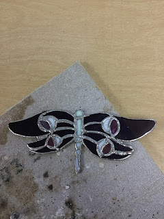
                      This is my finished stained glass project. To be honest, I am really proud of it. It took me a long time and a lot of precise grinding but it was worth it. One side has all the iridescent part of the glass and when it hits the light, it shines exactly how I wanted it to. The sautering could have been better and neater, and it is a bit asymmetrical. But it is what it is and I still am proud of it. I'm going to give it as a gift. Since the wings are based off the logo of one of my favorite podcasts, Nightvale, and my friend is a fan of it, I'm going to give it to them. Can't wait to get started on the next project